Logo Design Principles: What to Check Before You Choose
What should you look for when designing a logo or choosing between drafts? Practical checks for small sizes, single color, distinctiveness, registration and the files to ask for at handover.
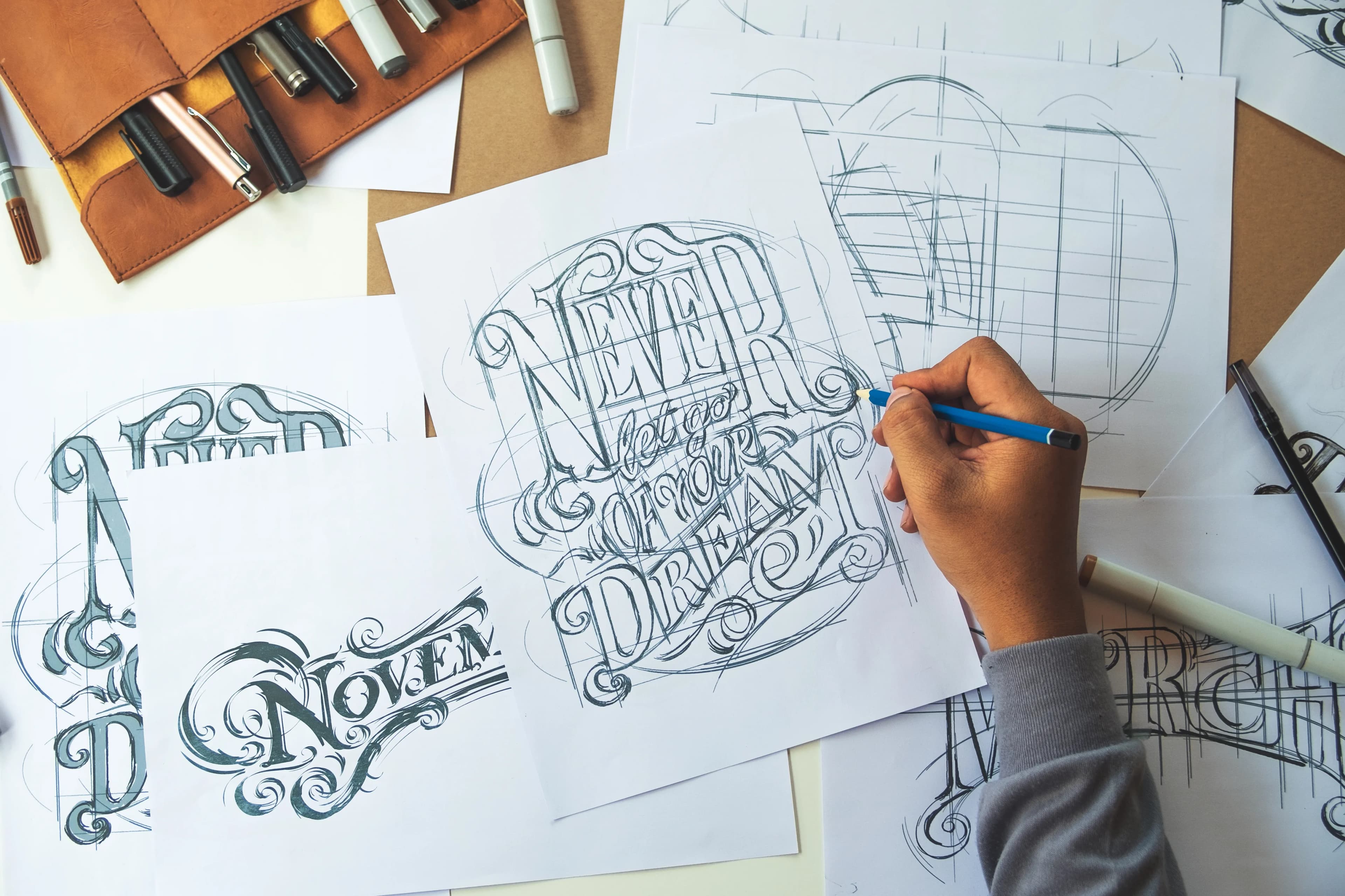
Three things matter most in logo design: the logo must stay legible at its smallest size, remain recognizable without color, and clearly stand apart from competitors. A logo that fails these three conditions will cause problems on a business card, a social media profile or a shop sign, however good it looks. When you choose between drafts, running the same tests on each one is all you need.
What is a logo for, and why does it matter so much?
A logo's real job is not decoration but distinction. Turkey's Industrial Property Law, for example, defines a trademark as a sign that distinguishes one business's goods or services from those of others, and lists shapes, colors and letters alongside words as signs that can be trademarks. In other words, a good logo is measured first by not being confused with others, and only then by whether people like it.
Customers usually see your logo for less than a second: the small icon in a search result, the corner of a product package, an email signature. In that brief contact, the logo has to make people think "that is them".
What should you pay attention to when designing a logo?
Is it legible at the smallest size?
A logo does not live at one size. Google asks for the site icon (favicon) shown in search results to be square and at least 8x8 pixels, and recommends an image larger than 48x48 pixels so it looks good across surfaces. In a space that small, thin lines disappear and long text cannot be read. This is why your logo needs a short version made up of the symbol alone. It also answers the common question of how detailed a logo should be: only as detailed as it can be while still working at that size.
Is it recognizable without color?
Your logo loses its color on stamps, engraving, single-color print, faxes or white-on-dark use. If the design only holds up thanks to gradients or shadows, it collapses in these situations. Reviewing a draft in black and white first is the fastest test for exposing a weak form.
Does it stand apart from competitors?
Companies in the same sector drift toward similar symbols: a roof in construction, an arrow in consulting, circuit lines in technology. These symbols are easy to understand but hard to remember. The law also states that signs lacking distinctive character cannot be registered as trademarks. Putting the draft next to your competitors' logos shows the distinctiveness problem plainly.
Does it fit the sector and the audience?
A children's clothing brand and a law firm cannot use the same visual language. Relevance means the logo carries the right level of seriousness and the right emotion. The yardstick here is not your taste but what your target customer expects when looking at the logo.
Will the typography last?
The typeface in a logo often decides how long the logo lasts. Very ornate typefaces, or ones tied to a passing fashion, look dated within a few years. Where possible, use custom-adjusted lettering or a typeface with a clear license. A logo built with a font whose license is unclear can cause problems in commercial use later on.
Was it prepared as a vector?
The logo should be built as a vector in a drawing program. A vector file can be scaled from business card size to a building facade without losing quality. A logo delivered only as PNG or JPG will have to be redrawn at the first large print job.
How do you test drafts when choosing a logo?
When a designer sends two or three drafts, asking "which one do I like more?" is misleading. Instead, run the same tests on every draft.
- Shrink test: Reduce the draft to 32 pixels wide. Can you still tell what it is?
- Black and white test: Convert it to a single color. Does the form hold up?
- Real surface test: Ask for mockups on a business card, the website header, an Instagram profile photo and packaging. Instagram's circular crop is particularly hard on horizontal logos.
- Five-second test: Show the logo for five seconds to someone who does not know it, then ask what they remember. What they remember is what really carries the logo.
- Side-by-side test: Place the draft among three competitor logos. A draft that disappears is eliminated.
The draft that passes these tests is the one that will do the job, regardless of personal preference. Even so, not leaving the final decision to one person's taste reduces "let's change the logo" debates later.
Which files should you ask for at handover?
A logo is not a single file but a set of files. At handover, ask for at least the following:
- Vector files (SVG, PDF or AI/EPS)
- PNG files with transparent backgrounds, in several sizes
- Horizontal, vertical and symbol-only versions
- Variations for light and dark backgrounds, plus a single-color version
- Site icon (favicon) and social media profile image
- Color codes: HEX and RGB for screens, CMYK for print, Pantone if needed
- A short usage guide showing the clear space around the logo and its minimum size
Without a usage guide, the logo gets stretched in different hands, its colors drift and the wrong typeface ends up next to it. These rules are usually prepared as part of a wider corporate identity project.
Registration and rights: before you start using the logo
Before sending the logo to print, check whether a similar mark is already registered. In Turkey, the Turkish Patent and Trademark Office (TÜRKPATENT) website offers a trademark search; other countries have their own registries. A name-only search may not reveal similar shapes, so for significant investments it is safer to consult a trademark attorney.
Under Turkish law, a registered trademark is protected for ten years from the filing date and can be renewed in ten-year periods. There is one more point besides registration: if an outside designer creates your logo, put in a written contract that the usage rights to the design belong to you.
What are the most common logo design mistakes?
- Trying to say everything: Squeezing all your services into one symbol makes the logo crowded. A logo is a sign, not a summary.
- Using stock icons: Symbols taken from icon libraries are used by hundreds of other companies and are often unsuitable for registration.
- Designing for a trend: The gradient or effect that is fashionable this year will make your logo look old in a few years.
- Testing only on screen: Colors come out differently in print than on screen. Get a proof before important print runs.
- Ignoring legibility: The web accessibility standard WCAG exempts text that is part of a logo from its contrast requirement; that does not mean an unreadable logo is acceptable. Contrast rules still apply to the tagline and menu text next to the logo.
Quick checklist before you decide
- Is the logo understandable at 32 pixels?
- Is it recognizable in a single color?
- Does it stand out among competitors?
- Is the typeface license clear?
- Have the vector files and all variations been delivered?
- Has a trademark search been done and have the rights been transferred by contract?
If you want to handle your logo together with a color palette, typography and usage rules, see our corporate identity work; if you only need a logo and printed materials, take a look at our graphic design service.
Related service
brand identity designSee how we work →How did this land for you?
Be the first to react
Found it useful? Share it:
Frequently asked questions
What is the right file format for a logo?
The master file should be a vector: SVG, PDF or AI/EPS. Transparent PNG files produced from it are used for the web and social media. A logo delivered only as JPG breaks up when enlarged and, because its background is not transparent, looks like a box on colored backgrounds.
How many colors should a logo use?
There is no fixed number, but most strong logos work with one or two main colors. The more colors you add, the higher the print cost and the harder it is to move to a single-color version. What matters is using the colors consistently and documenting their codes in the guide.
Can I use a logo generated with AI?
AI can help with ideas and direction, but using the output as is carries risk. The generated image may resemble other brands, its vector structure will not be clean, and distinctiveness problems can come up during registration. It is better to have a designer redraw the chosen idea as a vector.
Will a logo redesign make us lose existing customers?
A radical change can cause a short-term loss of recognition. That is why many brands simplify their existing logo while keeping its recognizable element, rather than starting from scratch. Rolling out the change across the website, social media and printed materials in the same period reduces confusion.
Sources
- 6769 sayılı Sınai Mülkiyet Kanunu — T.C. Cumhurbaşkanlığı Mevzuat Bilgi Sistemi
- Marka Araştırma — Türk Patent ve Marka Kurumu
- Define a favicon to show in search results — Google Search Central
- Understanding Success Criterion 1.4.3: Contrast (Minimum) — W3C WAI
Related articles
- Brand & Design
How to Design Product Packaging: Principles That Drive Purchase
The packaging design process step by step: the brief, information hierarchy, mandatory label information, print preparation and shelf testing, so your pack is noticed on the shelf and in online listings.
6 min read - Brand & Design
Brand Naming: How to Choose a Memorable Name You Can Register
Brand naming means generating candidates, screening them for language and pronunciation, then checking trademark and domain availability. Here are the name types, the process and the tests to run.
6 min read - Brand & Design
Product Catalog Design: Layout, Visual Hierarchy, Software and Print
Catalog design starts with content preparation, takes shape on a grid with template pages and ends with a print or PDF check. Here is which software fits when, how to build hierarchy and what to check before printing.
7 min read