Brand Typography: How to Choose the Right Font for Your Brand
Typography is arranging text so it is easy to read and carries character. Here is what to check when choosing a brand font: language support, legibility, licensing, pairing and web performance.
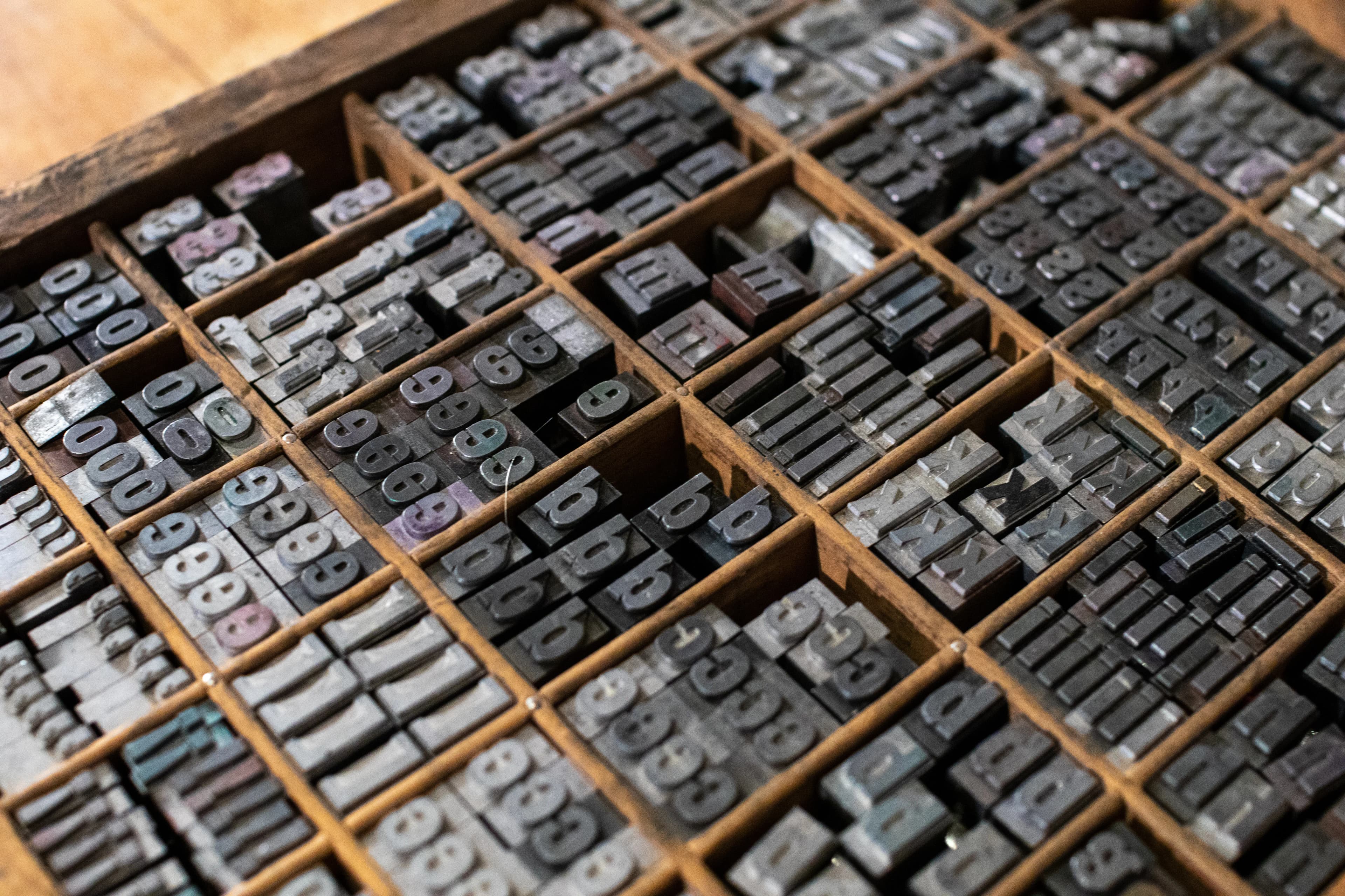
Typography is the arrangement of text so that it is easy to read and carries a character: which typeface you choose, at what size, with what line and letter spacing and in what hierarchy. When choosing a typeface for your brand, the right order is: first language support and legibility, then fit with your brand's character, then licensing, and finally a typography system built from different weights.
What is typography, and is a typeface the same as a font?
In everyday language the two words are used interchangeably, but designers make a distinction. A typeface is the shared design of the letters; a font is a file of that design in a specific weight and style. The light, regular, semibold and bold weights of a type family, along with its italic styles, are separate fonts. When choosing for a brand, look at a family that offers enough weights and styles rather than at a single font.
Typography is not just font choice. The same typeface can become hard to read when it is set with poor line spacing and a messy size scale.
What impression do the different type classes give?
There are no fixed rules, but the general impressions each class tends to create are a useful starting point:
- Serif: Small strokes at the ends of the letters. Suggests heritage, seriousness and an editorial tone; common in law, publishing and luxury brands.
- Sans serif: Gives a clean, modern impression; widespread in digital products because it stays legible at small sizes on screen.
- Slab serif: Thick, block-like serifs that give a strong, solid impression.
- Handwritten and script: Carries warmth and personality but tires the eye in long text; suitable only for short accents.
- Display: Typefaces designed for headlines and logos; eye-catching but not suited to body text.
- Monospace: Every character has the same width; strongly associated with technology and software.
Describe your brand with three or four adjectives (for example: trustworthy, warm, simple) and filter your candidates against them. If most of your competitors use the same class, choosing a different one can make you easier to tell apart.
What should you check when choosing a brand font?
- Language support: Test every character of every language you publish in, in both lowercase and uppercase, across all weights. In some fonts, accented characters were added later and sit crooked or are missing in the bold weight. If you publish in Turkish, for instance, write a test sentence and look closely at ğ, ş, ç, ö, ü and especially the capital İ and the dotless ı.
- Legibility: Can you tell the capital I, the lowercase l and the numeral 1 apart? Is the x-height (the body height of lowercase letters) tall enough that reading at small sizes stays comfortable?
- Family range: At minimum you need regular and bold, ideally semibold and italic as well. Variable fonts offer many weights in a single file.
- Licensing: Is every channel you will use (website, print, mobile app, logo) covered by the license?
- Testing with real content: Try the font with your actual headlines and copy, on a phone screen, on a printed business card at a small point size and on a dark background.
How do you pair fonts?
For most brands, two type families are enough: one for headings and one for body text. The goal in pairing is contrast. Two sans serifs that look almost the same do not read as different; they only create clutter. Common patterns:
- A characterful serif for headings with a neutral sans serif for body text
- A strong sans serif for headings with a legible serif for body text
- A hierarchy built from weight and size differences within a single large family
The last option is the safest. A single family keeps things consistent and reduces the number of files your website has to load.
What does typography on a website need?
On the web, font choice also affects performance and accessibility:
- File format and size: Google's web.dev guidance recommends using only the WOFF2 format and reducing file size by splitting fonts into subsets (subsetting). When subsetting, make sure you keep the character ranges your languages need. Turkish letters, for example, sit in Latin Extended, and if that range is dropped, ğ and ş appear in a fallback font.
- Loading behavior: The font-display setting decides whether text is hidden until the font arrives. swap shows the text immediately in a fallback font; optional puts performance first.
- Language declaration: Declare the page language correctly with the lang attribute. On a Turkish page that is not declared as tr, an i converted to uppercase with CSS can appear as a dotless I instead of İ. This small error shows up often in headings and buttons.
- Text spacing: Success Criterion 1.4.12 of WCAG 2.2 requires that content does not break when a user increases line height to 1.5 times the font size, spacing after paragraphs to 2 times, letter spacing to 0.12 times and word spacing to 0.16 times. That is why you should not design heading and button boxes with a fixed height. We cover the topic in full in our article on web accessibility and WCAG.
What should you watch for in font licensing?
Most typefaces on Google Fonts are offered under the SIL Open Font License (OFL). The OFL allows commercial use of the fonts in books, posters, logos and websites; it prohibits selling the font file on its own. With paid fonts, desktop, web, app and e-book licenses are often separate, and embedding a font bought with a desktop license on a website can be a license violation. If you plan to use a paid font in your logo, read the license terms for that use specifically.
Where should your typography rules be written down?
The chosen fonts should be documented in your brand guidelines with a typography table: font, weight, size and line height for each heading level, body text, captions and buttons. For the web, if these values are defined as variables in your design system, nobody has to guess sizes when a new page is added. You will find the other sections of a guidelines document in our article on building a brand book, and the link between type and logo in our piece on logo design principles.
In short
- Typography is not just picking a font; it is the whole of size, spacing and hierarchy.
- Test language support and legibility first, then look at fit with your brand's character.
- Two families are usually enough; look for contrast, not similarity, when pairing.
- On the web, check WOFF2, correct subsetting, a suitable font-display value and the right lang attribute.
- Confirm the license covers every channel, and write the rules into your guidelines.
If you would like to build a typography system for your brand, take a look at our corporate identity service.
Related service
brand identity designSee how we work →How did this land for you?
Be the first to react
Found it useful? Share it:
Frequently asked questions
What is a typographic logo?
A typographic logo is built only from specially arranged letters of the brand name, without a symbol or icon. It usually starts from an existing typeface, and then letter spacing, ligatures and some letterforms are customized for the brand, so you need to make sure the license allows use in a logo.
Should the font in my logo also be used on my website?
It does not have to be. Logo fonts are often display faces or custom drawn, so they do not read well in long text. A common approach is to choose a heading font close to the logo's character and a legible body font, and to use the logo as a separate image.
What is kinetic typography?
Kinetic typography is an animation technique in which text moves: words enter the screen, grow, rotate or follow the rhythm of speech. It is used in promotional videos and social media content to get the message across even when viewers watch without sound, but the text still needs to stay on screen long enough to be read.
Can I use a free font in commercial work?
It depends on the font's license. Fonts offered under the SIL Open Font License are suitable for commercial use, logos and websites. On free font sites, however, some fonts are free for personal use only, so read the license file before downloading and keep a copy.
Sources
- Choosing Type – Fonts Knowledge — Google Fonts
- Best practices for fonts — web.dev (Google), 2022-10-04
- Understanding Success Criterion 1.4.12: Text Spacing — W3C WAI
- The SIL Open Font License — SIL International
- SIL Open Font License Official Text — SIL International
Related articles
- Brand & Design
Brand Naming: How to Choose a Memorable Name You Can Register
Brand naming means generating candidates, screening them for language and pronunciation, then checking trademark and domain availability. Here are the name types, the process and the tests to run.
6 min read - Brand & Design
How to Choose a Brand Color Palette: Steps and Usage Rules
Color psychology alone will not give you a brand palette. How many colors you need, the primary, secondary and neutral structure, WCAG contrast ratios, screen and print consistency, and what your guidelines should hold.
6 min read - Brand & Design
What Is Rebranding, and When Should You Rebrand Your Business?
Rebranding means renewing a brand's name, identity or positioning. When it is needed, when it is not, the steps of the process and how to avoid losing traffic during the digital transition.
6 min read